QUORI
UI-UX Design
THE projeCt
Quori is a wealth management platform aimed at a broad audience, with the ambition of making this type of service more accessible.
The goal was to design a product that instills confidence while modernizing the often rigid image of the sector.
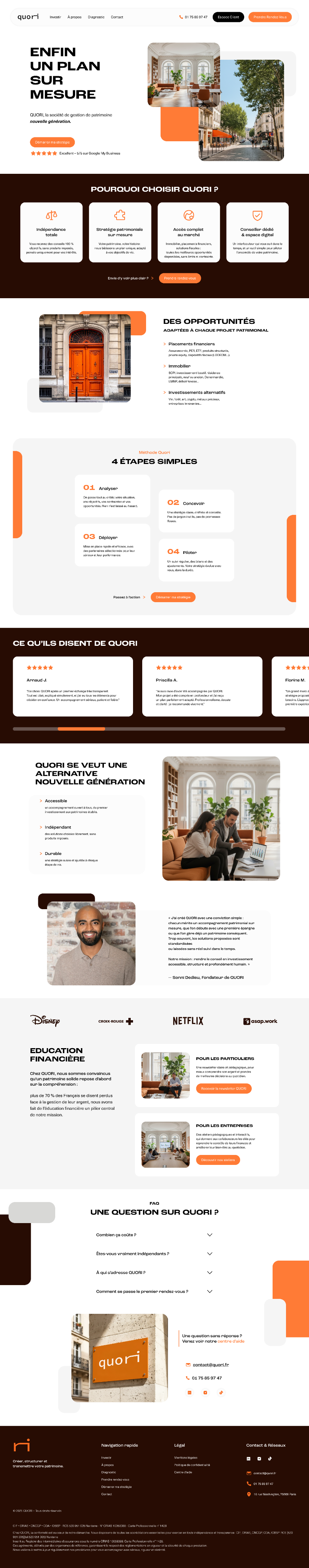
THE dIRECTION
The project rests on a balance between credibility and modernity, with a contemporary visual direction built around a white, orange and brown palette, bringing warmth and readability to an industry that tends to feel cold and distant.
I designed the entire product, from UX thinking through to the final interface on Figma, with a focus on creating an experience that feels clear, dynamic and approachable.
The design was built to be production-ready, developed in close collaboration with a developer for implementation.
QUORI
UI-UX Design
THE projeCt
Quori is a wealth management platform aimed at a broad audience, with the ambition of making this type of service more accessible.
The goal was to design a product that instills confidence while modernizing the often rigid image of the sector.
THE dIRECTION
The project rests on a balance between credibility and modernity, with a contemporary visual direction built around a white, orange and brown palette, bringing warmth and readability to an industry that tends to feel cold and distant.
I designed the entire product, from UX thinking through to the final interface on Figma, with a focus on creating an experience that feels clear, dynamic and approachable.
The design was built to be production-ready, developed in close collaboration with a developer for implementation.